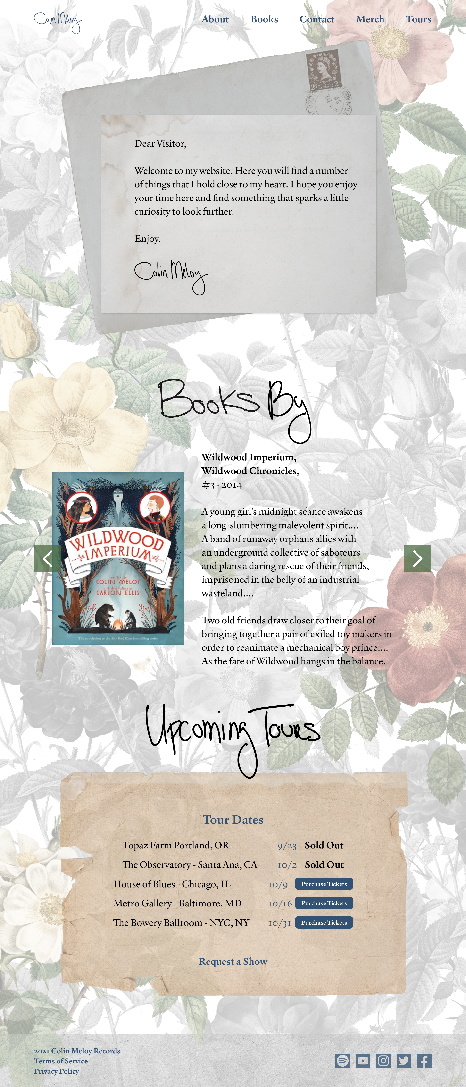
Design Goals
This branding suite was created to represent a maximalist view of reality and texture within a digital space. Drawing from the historic overtones of Meloy’s song lyrics and his warmth, love of nature, and his unique individuality, the tone set within this branding set evokes a sense of nostalgia and nature in an unnatural setting.
I chose to create a handwritten logo for the brand so it maintains a personal note with the overall look and feel, while the use of a serif font allows the content of the page to remains legible but also closely ties into the look and feel of the logo itself.
The colors used in this brand are based off of a painting by Colin Meloy’s wife Carson Ellis, again pulling a textural nature, a woodsy warmth, and a soft earthy tone that is complimentary to the other visual aspects of the brand.
Using imagery of vintage ink prints and found paper materials invokes a sense of finite information placed within the page. Reusing a scrap of paper found on the floor, a forgotten notecard in a book, a postcard sent by a friend, all draw on the feeling that the information contained within the paper is precious and exciting to rediscover. In the same way, the scraps of paper used throughout the brand will draw a sense of remembrance and kinship with materials used in childhood or adolescence which adds to the whimsy of the site.
The following assets include the final style guide and the combined homepage. The full suite of webpages can be viewed here, and the full suite of social assets can be viewed here.

